Ever since we did a serious aesthetic rehaul of the Boswyck Farms’ Hydroponic Course Book, I’ve been itching to practice book and print layout. One, to practice using the baseline (which I had no idea about until I read Ellen Lupton’s book on type) and two, to practice creating templates and overall styles that would -in theory- be used by other people to maintain a recognizable brand over a period of time.
While chilling at our local tavern, a magical opportunity presented itself.
My partner has a prolific history in print production, which I am fairly envious of. The owner of our neighborhood bar has been trying to get a zine-y newspaper together. He had all the content, but was held up on the layout. A patron had volunteered to do it, but after getting escorted out on a bad night, dropped the ball.
So a few beers/whiskeys in, a fellow bartender asked us (but mostly, my partner) if we had any experience with InDesign and if we’d be able to knock this out. Partner was like, yeah sure, and I was like OOOH ME OHH ME *hand waving in the air*.
Note: if you’ve ever met me in real life, that all happened in my head and what came out was more like, “yeah that would be great”.
So our saturday morning was spent hovering around a large monitor as my partner started to clean up the existing .indd and create a master template for the paper. For me, watching him work was a pleasure. I got to see how a professional designer attacks a project. What stood out was how much I rely on eyeballing as opposed to math. My partner doesn’t draw, he does math. This is one of my major weaknesses that I need to overcome.
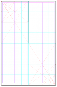
We created a 4 column spread loosely based on the golden ratio, with inspiration from the New York Times, as one of the most iconic and classic newspapers that we have in our country. (Die Welt would be my next choice, but our polish/slavic neighborhood weirdly doesn’t have that around.)
As the reader’s eyes scan down the rag, headlines minimize, indicating the priority of the stories just with design cues. Which is a really simple concept but I love how it works for the human brain. We did the same, but I wanted to use the proportions of the golden ration to prioritize content. Top half, one major story, with each half further divided until the bottom right corner was down to the smallest bits of content:
The top divisions gave us the proportions for the newspaper’s header and logo. (Once the paper is out and official, I’ll follow up with an actual shot of how it worked out.)
The grid wasn’t exact with the ratio, but it was a good jumping point. Plus, that seems to be the secret of design. Knowing when you’ve used a tool to its fullest extent and it’s time to deviate from the rule. Or taking your personal best guess.
At this point, we had done enough groundwork just on structure that the paper looked much better, even with the fonts that we inherited the project with. Which led us to the major point of contention: typography choices.
Partner and I have vastly different aesthetic preferences. I like busy, loud, overwhelming colors, patterns- as if I want my surroundings to replicate the chaos of my ADHD brain. He prefers clean lines, white space, no clutter, stark contrast, minimalist. Sometimes I wonder if he may be a robot. So choosing fonts for this newspaper was a small battle.

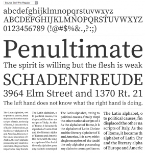
I acquiesced to his experience in the end. While I was on board with serifed type for the body text, I still liked the look of the sans serif titles that the previous design had adopted. I wasn’t a fan of the Impact font itself, but I still like the blockiness of it. Partner wanted none of it. He wanted one solid serif to rule them all.
FontSquirrel came to the rescue and we went with Source Serif Pro (after double-checking the license for our intended use).
I was still not entirely convinced of using one typeface for all headers and text, but once we started setting up the paragraph styles, I was sold.
Out of the ashes rose a respectable looking spread and as I fixed the content layout, it made for a very flexible template that accommodated both standard news stories and creative writing pieces of poetry. The grid worked and when it was time to deviate, it still left the flexibility to hint at its foundation.
I’m anxiously awaiting the owner’s return from vacation so we can get his feedback. And I’m excited that we’ll be able to contribute content too, I’m planning to try my hand at crossword puzzles. Hopefully I’ll be taking on layout for all upcoming issues as well.
The other things that really clicked for me in this project was learning some new tools in InDesign that made my life way easier: change text case, and align to vertical/horizontal centers, and FINALLY setting up styles that flow into each other properly.


For someone who is adverse to order and structure, there is something about the exactness of design that really makes me feel content. How odd.


