And by ‘funny’, I mean wholly not.
I experienced my first NY shooting.
I happened to be in Borough Hall where two guys dashed by me on the raised walkway between the uptown and downtown platforms followed by another man, gun in hand. He paused at the top of the stairs before heading down the stairs to the platform. Several seconds later, we all heard a gunshot and it was a mad dash out of the station. After decompressing with some other ladies outside, remembering how to breathe, we all went on with our evenings.
So it goes.
My destination was the New York Transit Museum in downtown Brooklyn, housed in an old subway station on the corner of Boerum and Schermerhorn. Thanks to the skint, I signed up last minute for an after-hours presentation on Subway Etiquette: Then and Now. The MTA’s latest ad campaign, Courtesy Counts, has been a huge success for taking on some of the most irksome pet peeves for public transportation.

The behaviors in question came almost exclusively from customer feedback letters and emails, according to MTA Corporate Comm Chief Connie Depalma. My primary peeve -not letting people out before trying to get in- was there, followed by my close second hated, the manspreading. Her own personal peeve was nail clipping and nail polish on the LIRR. I’ve experienced both of those as well, but they are a rarer annoyance.
Unfortunately, I missed the first half of the panel discussion because of the situation at Borough Hall. What I did hear was the Director of Graphics, Rick Stewart, discuss his approach to drawing the characters, his method of demonstrating desired versus disruptive behavior on public transportation. You see a couple of them in the upper left corner below:
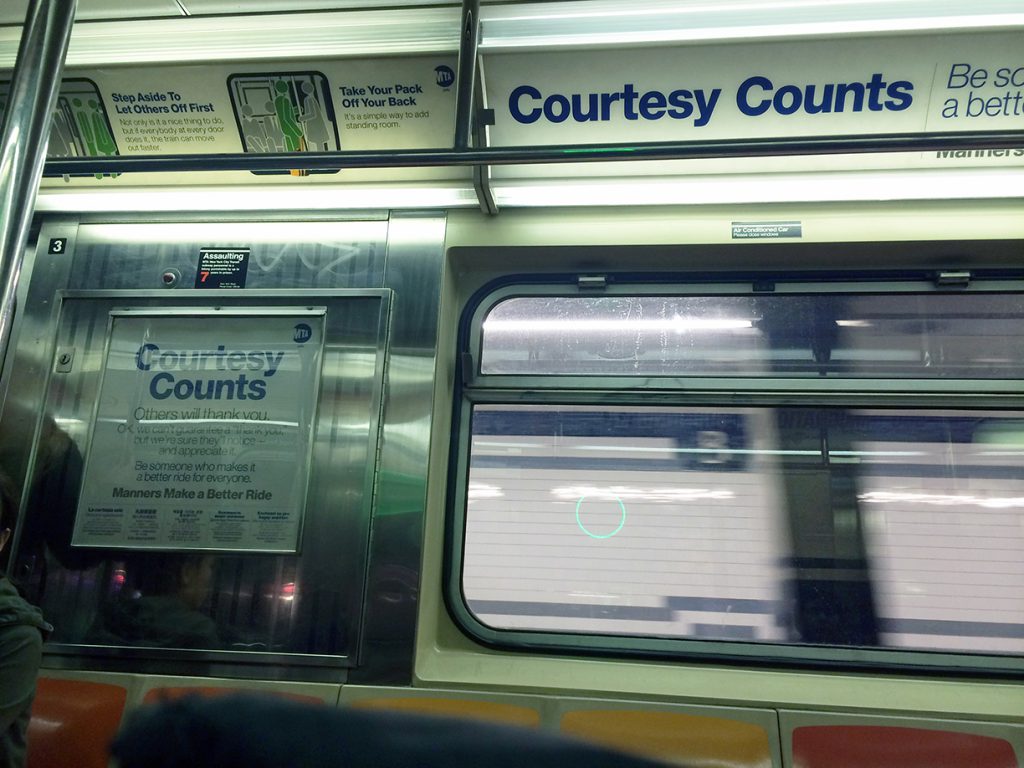
One woman had a great follow-up question that I felt he glossed over too quickly, missing some intrinsic social-cultural-racial issues wrapped within the question: why were positive behaviors more frequently depicted by green figures in ties and professional dress as compared to the negative behaviors (as red characters) who were unadorned? I was looking at this more closely when I was in the subway last night and took the photos above. While there is some mix of minor style implications on the figures, it would have been interesting to offer several variations within the same compositions to show that everyone is guilty when it comes to breaches of transportation etiquette.
For me, her question pushed to mind some of the most crowded and tense subway rides that I’ve experienced (on the 4,5,6 especially) during rush hour, populated with the more formally dressed business folks. I have witnessed significant social faux pas amongst that population, even more frustrating because their attitude is that they are above the common social expectation of situational awareness.
In the wake of the shooting at Borough Hall, I also wonder how the courtesy lapses between passengers (both the 3 men in questions and other bystanders) contributed to the escalation between the shooter and the two other men…
Just wish we had explored that question a bit deeper, exposing some of the assumptions made by the graphics department on who exhibits what behaviors.
Back to type-related things!
My main interest in attended was viewing some of the subways ads pulled from the archives that covered many of the same issues that the current courtesy campaign was tackling. The humor was unique to each time period, except for a stale period in the late 80’s and 90’s where the ads were bland and sanitary. I remembered that era from trips to the city as a kid for motorcycle shows at the Javitz center.
Below are some mediocre iPhone photos of the collection on display.

As a fatty, this one made me chuckle. If I’m dying, I will squeeze between but most often I’m too self conscious about fitting and touching other people to do it.


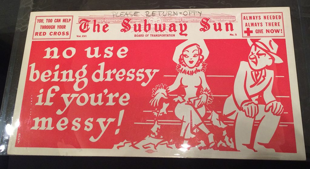
Note the transition from Board of Transportation to New York City Transit Authority, which took place in 1953:

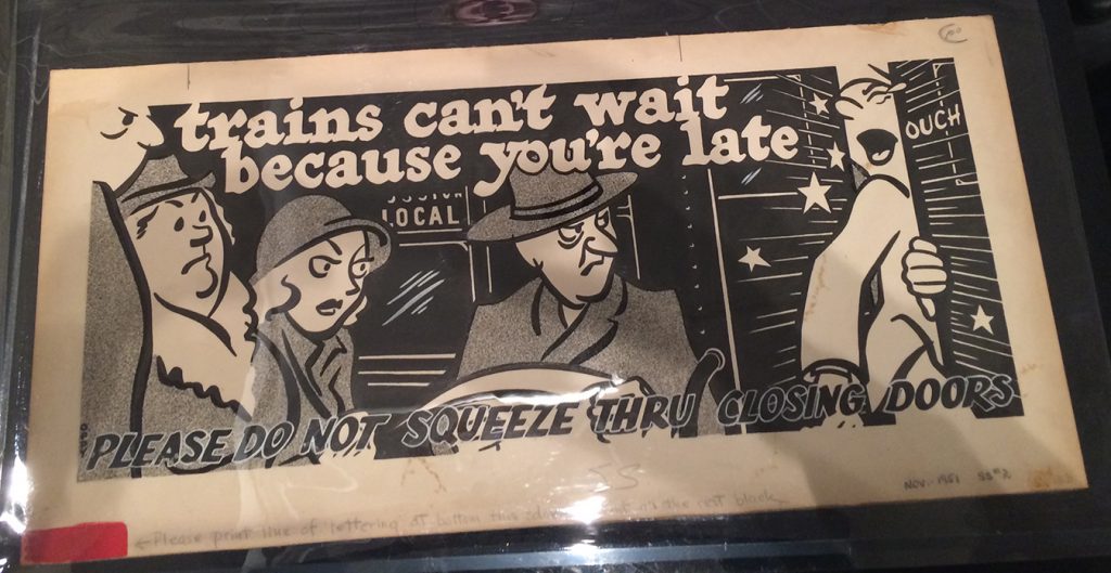
This print in particular stood out, it wasn’t a finished product. The bottom line was added on by hand:
A naming contest for the ‘animals’ of transit: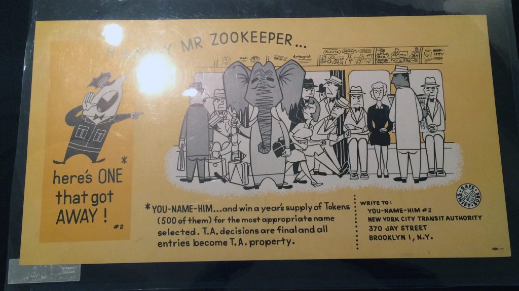
1962’s Etticat should really make a comeback. The internet awaits! 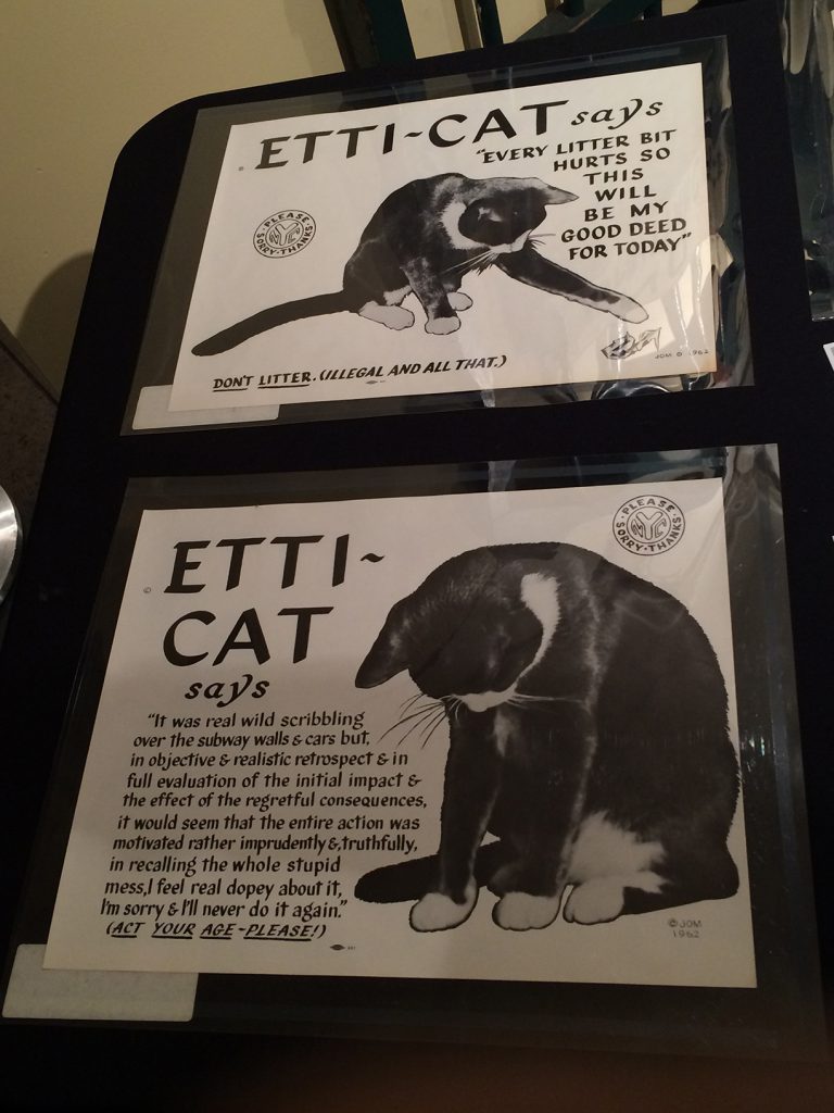
If you look closely, you’ll see a small logo on the previous ads. That’s the Amalgamated Lithographers of America, started from a secret fishing club.
The drab:
Attendees were allowed to putter around the museum afterwards. This wasn’t my first visit, I had taken my best friend Sarita as a Christmas present a few years ago. Since then, my interests have changed significantly and I was looking carefully at the signage, the markings of who made them, manner of production, etc. I noticed that some were even painted over and over again.
These two signs below were enamel/porcelain on metal, a method of production that only lasted for a short time in the US (1890s-1940s). It was an easy way to reproduce signage (with stencils at first but later on, by silkscreen) but it wasn’t necessarily cheap. When WWII kicked in, the metal needed for the base of these signs was diverted to war-related manufacturing. That was the end of the enamel sign in America.

One of the highlights of the museum is the collection of subway cars spanning the last 80 years. In the older train cars from the 1930s, you can see that the destination signs were a bit shaky and irregular.

The older cars are olive green, riveted, perfunctory, the whole car felt almost militant aside from the woven seat covers. The hand-written signs soften it up quite a bit. Maybe it was a temporary solution or a late add-on? Maybe the museum added it?
The ads in the cars were also fun. I didn’t get to ask if they were originally in the car or just there to give a flavor of what the ride would be like. This one in particular was my favorite:

If you haven’t visited yet, definitely check out the NY Transit Museum. I am adding it to my short list of suggestions for people who visit NYC and don’t want to do the ‘touristy’ stuff. Public transportation is such an important part of living here that learning about its history can only give you that much more insight to the city itself.