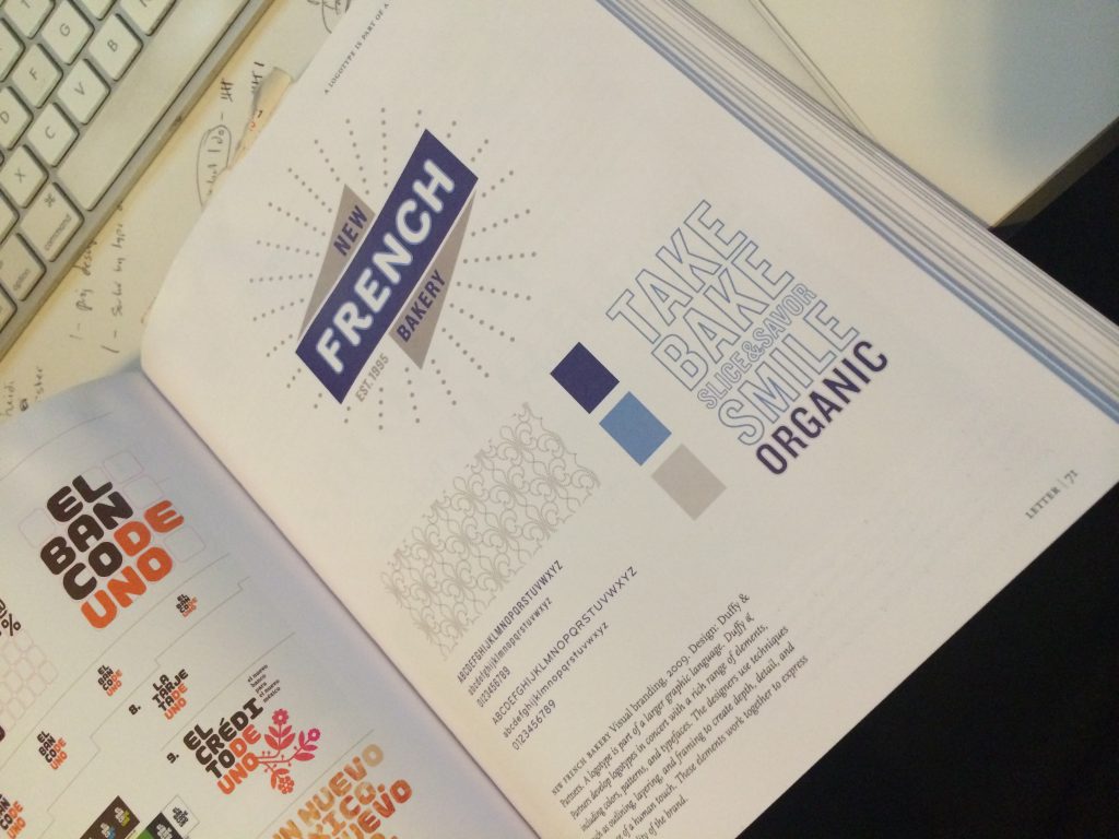
In November, I went on a shopping spree on Amazon and bought a bunch of graphic design and typography books that were highly recommended on pertinent subreddits. The thought process was, “I’ve essentially dicked around with design and type as a hobby for much of my life, it is time to sink into the wealth of knowledge and theory that underlies practice.”
My first round of purchases included Making and Breaking the Grid (Timothy Samara), Meggs’ History of Graphic Design, and Thinking with Type (Ellen Lupton). I’ll obviously be plugging through Meggs for the next 10 years, but the other two books went quick. I hungrily read them up on my train rides to work, pieces of advice I’d heard in passing before and all sorts of functionalities in ACS finally made sense (example: ALIGN TO GRID! Now I get it. I feel like an idiot.)
Lupton’s book really blew open my brain and is what inspired me to start this blog. As I started to pay more attention to the typefaces and fonts I used for my own work, and to what was presented to me from the world at large, I decided, “Well, I want to make a font!”
Having little to no comprehension of just how –hard-timeconsuming-intense-precise-detailorientied- it would be to make a typeface from scratch, I started googling with the idea that I would make one of my own. (ha.)
And so, I came across this piece from Jeremy Mickel on I Love Typography, about his experience designing Router based on a handmade MTA sign. This post is the reason I abandoned (for the immediate future) any ideas of making my own font. Mickel was already an established graphic designer with much more expertise and skill, and it took him a year and a half.
“This moment of inspiration in a subway station was the beginning of the year-and-a-half process of designing my first typeface, and the start of an obsession that would permanently change the way I experienced the world. I thought I knew a lot about type as a graphic designer, but I soon realized that the art of typography went much further and deeper than I could have imagined.”
While his process was daunting, it did inspire me to push harder into learning about what has already happened in the world of typography. To learn the fundamentals and what came before, how written word has evolved through time, how technologies shaped that evolution, how that evolution plays out today with much lower obstacles to participation in this process. With that in mind, to pay more attention to the artistry and craftsmanship behind typefaces, and know what to look for in a good design.
What also caught my eye, was that the font Mickel created, Router, was used in a type example in Lupton’s book but wasn’t explicitly mentioned:
See the swelling that Mickel talks about? This is the distinctive feature of the font that made it possible to identify. I remember when I was reading, really liking the logo and how the font was incorporated. Then maybe 2-3 weeks later, I happen to stumble upon the story of its genesis? It was one of those moments where you start thinking that there may be some order to existence after all. (Momentary thought, jury is still out for me.)
And as my last takeaway, I learned to be on the lookout for more of these legacy treasures, peppered throughout New York City. I watch for indicators that a sign was handmade, tiled on site, handpainted, etc. The city expanded in an era where aesthetics and grandeur were important, there are gorgeous views all around. At the very least, it makes waiting for the subway late at night hat much more bearable and beautiful.


