TYF Abroad: Part 1: A Love Letter to the SeaCity Museum

After 8 days at sea, crossing the Atlantic on a luxurious boat, and 3ish days in London, I’m back home in New York waiting to start a new job.

While on the boat, we decided to lock up our electronics and cut ourselves off from the world. It was wonderful. This does mean I don’t have a whole lot (read: any) photos of Cunard’s Queen Mary 2. It was a massive cruise liner, and possibly the fanciest experience I’ve ever had.
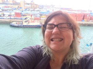
Ok, I got one photo: docking in Southampton.

Before boarding the train to London, I wanted to explore Southampton. Mainly, the SeaCity Museum which features an exhibit on Southampton’s Titanic Story. Many of the crew members who perished lived in or around that area and aside from being a major seaport, the Titanic story is what the city is most known for.

I’m no expert on museum design, but the Sea City Museum is extremely well done. Surprising, the Titanic portion paled in comparison to the exhibit on the history and artifacts from the local area, Southampton: Gateway to the World.

A major football (soccer) arena was built in Southampton and a host of archeological treasures were found during construction. They threaded the city’s history (and significant immigration events over time) from early pre-agricultural days to the present century with the remains of a tree trunk viking canoe, ancient bronze tools, luxurious jade axe heads, Roman coins, several styles of pottery and glassware, through to modern day tokens representing major migrations spurred by wars abroad.

My favorite tidbit was learning about Hampton Board Serge, a type of wool weave introduced to the area by Huguenots immigrants seeking safety in England (thanks, Henry VIII?). The craft was mostly dominated by women, which seemed refreshing to read about. Or at least one woman, Judith de le Motte, who continued her husband’s business after his death. (More details about her and hampton serge here.)

The interactive map in the center of the space was really cool and well done. It tied the artifacts on display to where in the city they were uncovered. It allowed up to 4 users (I think, as I was the only person there at the time) to zoom in, rotate the map, and select info points. The designers also set it at a height that was suitable for both younger and older museum visitors.
Photo sourced from scenapro.com

The Titanic exhibit catered more to school trips. There was less dense information spread out over larger spaces, easily accommodating a student group of 20, which I had the *ahem* pleasure of witnessing in action.

The info panels weren’t terribly fascinating if you’ve ever had a casual interest in the event, but the personal items on display were interesting. Several examples of work papers, photos of survivors and how they escaped, artifacts that helped assemble an understanding of daily life in 1912.

My favorite part of the Titanic exhibit was the section covering the trial. Here’s where the location of the museum was smartly incorporated. The museum is housed in a former city building and courthouse. All of the post-sinking inquiry and trial information is presented before entering an actual courtroom. Inside the courtroom, images of key figures and audio of their testimonies are projected on opposite sides of the courtroom. By the time I got to that part, the students were still in an earlier section but I can imagine that it would be a fun experience, even if I were too young to appreciate the design behind the setup.

I found photos of the museum from the agency who created the exhibits. Unfortunately photos are not allowed in the museum.

Downstairs near the cafe where I had left my partner to reunite with his digital life were WORKING games from the era. I didn’t play any, I didn’t have any pence yet, but I was thinking how awesome Coney Island would be if it could get its hands on machines like that.

I guess it makes me wonder what this generation of designers, artists, manufacturers, entertainers, builders, programmers will leave behind as lasting pieces of the time. Much of our lives exist as intangible goods that only have meaning so long as people can find them or more important, find them interesting.

The Victorians made things to last. Large and in charge, ornate and excessive. Factories still use their machinery and equipment today. I can’t say one style is better than the other, each system is born out of a tangle of social-economic-political factors that make them possible. They built for a legacy, for tradition.

The idea of leaving a legacy no longer seems important and I wonder if that’s a result of a culture that is driven by goods -tangible and otherwise- that are fleeting.

Anyways, if you ever happen to be in Southampton with two hours on your hands, check out SeaCity Museum.


TYF Mission Creep: Making my Halloween

While I started this site to chronicle my interest in typography, it has morphed into a receptacle for all interests design. With Halloween around the corner, my focus has shifted to costume design and construction.

Partner and I are headed to 2 parties, one of which is dictating the theme of our costumes (cards of the Major Arcana, or other mystical-ish ideas). Which is cool since I know nothing about tarot cards or their meanings. The second party is circus themed and coincidentally, we are going with a friend who is dressing up as a fortune teller. Perfect.

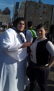
A few months ago, a coworker had sent my partner a picture of a tarot card illustration that looked exactly like him. Which means, his choice for costume was easy. He is going as  The Emperor (or Authority, in the psychic tarot deck).

Yep, that's him for sure.
Yep, that’s him for sure.
Rider Waite Emperor
Rider Waite Emperor

While his choice was quick and easy, essentially served up on a platter, I was at a loss for what to be. I’m in between jobs, so I wanted to use the time to make a badass costume. It has been a few years since I went all out and made costumes to be proud of, like…

Snow White, entirely from scraps (the yellow was curtains on my closet throughout college and grad school)
Han Solo and His Bearded Lady Leia
Han Solo and His Bearded Lady Leia at ComicCon

And none of the major arcana cards that were the female equivalent of The Emperor were really calling out to me. I prefer evil, dark, and scary. Which lead me to the Death card, XIII.

Death on its own Two... Feet?
Death on its own Two… Feet?
Death on a Horse
Death on a Horse

I’m opting for Death sans horse, but I will bring in the white rose to embrace both styles of art. What made this card work for me in particular was that it would accommodate the addition of a Plague Doctor mask, an image I’ve been drawn to for a while and felt like it would be a perfect addition to the costume.

Paul_Fürst,_Der_Doctor_Schnabel_von_Rom_(Holländer_version)

The past two weeks have been spent on paper mache and making my partner’s costume. I had scrap fabric that was perfect for his Authority tunic, and found some nice purple velvet for a cape. While being a large dude, he is still a very boxy shape and his costume was easy to design. I did use the opportunity to improve on my finishing techniques. Selvages were done, I ironed obsessively for crisp seams, and I finally got the hang of properly finishing a neckline with bias facing. Partner is sourcing his own hardware for his belt and cloak fasteners, and the last touch will be pairing my paper mache laurel leaves to a wire wreath and painting.

All good on The Emperor front, but I’ve been dragging my butt on getting Death started. I’ve sourced all my fabric and notions but aside from getting the paper mache parts 75% of the way done, I’ve not cut a single pattern. That will (have to) change tonight.

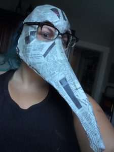
The paper mache has been going very well, a separate post is coming up to show how it was done. But here’s a checkpoint on what I’ve got so far. Quite pleased with how it turned out.

Really brings out the flour paste crud on my shirt.

I’ve got a staff and scythe blade in the making as well.

Hopefully by the end of tonight, I’ll have my patterns drafted for my cloak and corset. I’m debating incorporating feathers as epaulettes, as I was inspired by some pinterest posts. Pinterest is the würst, so many pretty things, so little time.

(I also started learning how to tat lace so I could make a neckline like that.)

So there you go. This month’s material will totally not be about typography, definitely not about graphic design, but about this other design-related hobby that I am profoundly passionate about.

The Quiet American – A Journey into Newspaper Layout

Ever since we did a serious aesthetic rehaul of the Boswyck Farms’ Hydroponic Course Book, I’ve been itching to practice book and print layout. One, to practice using the baseline (which I had no idea about until I read Ellen Lupton’s book on type) and two, to practice creating templates and overall styles that would -in theory- be used by other people to maintain a recognizable brand over a period of time.

While chilling at our local tavern, a magical opportunity presented itself.

My partner has a prolific history in print production, which I am fairly envious of. The owner of our neighborhood bar has been trying to get a zine-y newspaper together. He had all the content, but was held up on the layout. A patron had volunteered to do it, but after getting escorted out on a bad night, dropped the ball.

So a few beers/whiskeys in, a fellow bartender asked us (but mostly, my partner) if we had any experience with InDesign and if we’d be able to knock this out. Partner was like, yeah sure, and I was like OOOH ME OHH ME *hand waving in the air*.

Note: if you’ve ever met me in real life, that all happened in my head and what came out was more like, “yeah that would be great”.

So our saturday morning was spent hovering around a large monitor as my partner started to clean up the existing .indd and create a master template for the paper. For me, watching him work was a pleasure. I got to see how a professional designer attacks a project. What stood out was how much I rely on eyeballing as opposed to math. My partner doesn’t draw, he does math. This is one of my major weaknesses that I need to overcome.

We created a 4 column spread loosely based on the golden ratio, with inspiration from the New York Times, as one of the most iconic and classic newspapers that we have in our country. (Die Welt would be my next choice, but our polish/slavic neighborhood weirdly doesn’t have that around.)

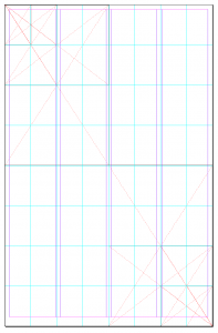
As the reader’s eyes scan down the rag, headlines minimize, indicating the priority of the stories just with design cues. Which is a really simple concept but I love how it works for the human brain. We did the same, but I wanted to use the proportions of the golden ration to prioritize content. Top half, one major story, with each half further divided until the bottom right corner was down to the smallest bits of content:

Screen Shot 2015-09-15 at 2.08.47 PM


The top divisions gave us the proportions for the newspaper’s header and logo. (Once the paper is out and official, I’ll follow up with an actual shot of how it worked out.)

The grid wasn’t exact with the ratio, but it was a good jumping point. Plus, that seems to be the secret of design. Knowing when you’ve used a tool to its fullest extent and it’s time to deviate from the rule. Or taking your personal best guess.

At this point, we had done enough groundwork just on structure that the paper looked much better, even with the fonts that we inherited the project with. Which led us to the major point of contention: typography choices.

Partner and I have vastly different aesthetic preferences. I like busy, loud, overwhelming colors, patterns- as if I want my surroundings to replicate the chaos of my ADHD brain. He prefers clean lines, white space, no clutter, stark contrast, minimalist. Sometimes I wonder if he may be a robot. So choosing fonts for this newspaper was a small battle.

IMG_5875
Welcome to My Office.


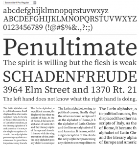
I acquiesced to his experience in the end. While I was on board with serifed type for the body text, I still liked the look of the sans serif titles that the previous design had adopted. I wasn’t a fan of the Impact font itself, but I still like the blockiness of it. Partner wanted none of it. He wanted one solid serif to rule them all.

FontSquirrel came to the rescue and we went with Source Serif Pro (after double-checking the license for our intended use).

Screen Shot 2015-09-15 at 2.18.56 PM

I was still not entirely convinced of using one typeface for all headers and text, but once we started setting up the paragraph styles, I was sold.

Out of the ashes rose a respectable looking spread and as I fixed the content layout, it made for a very flexible template that accommodated both standard news stories and creative writing pieces of poetry. The grid worked and when it was time to deviate, it still left the flexibility to hint at its foundation.

I’m anxiously awaiting the owner’s return from vacation so we can get his feedback. And I’m excited that we’ll be able to contribute content too, I’m planning to try my hand at crossword puzzles. Hopefully I’ll be taking on layout for all upcoming issues as well.

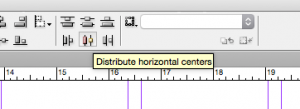
The other things that really clicked for me in this project was learning some new tools in InDesign that made my life way easier: change text case, and align to vertical/horizontal centers, and FINALLY setting up styles that flow into each other properly.

Screen Shot 2015-09-15 at 2.25.13 PM
WHAT SORCERY IS THIS? (Seriously, I used to put content in excel to use =Proper(). How silly.)


Screen Shot 2015-09-15 at 2.25.41 PM
Whaaaat! It’s the little things in life, really.


For someone who is adverse to order and structure, there is something about the exactness of design that really makes me feel content. How odd.

“The Worst Portfolio Ever.”

I’ve been poking through portfolio examples lately, in a half-hearted effort to get my own design interests going in any direction aside from nowhere.

Back in February, I took an hour or so and plugged through a collection of 40 brilliant portfolio sites, as curated by Creative Bloq here.

The first page of works definitely caught my attention and gave my heart a flutter of panic: I am a Hack. I have no Body of Work. I’ve been designing stuff on the fly for the same company for 3 years, on top of my regular job as development director. WTF do I even put in a portfolio?? What skills do I have to showcase?

Ignoring the panic, I continued on through the next 3 pages. The editor(s) may have lost some steam in their project as they added to their list of 40. I felt better as I got to the end, felt that I could connect better with what the artists and designers were presenting and how they displayed it on the inter webs.

[Then came Wisdom Teeth surgery and Vacation.]IMG_4611

It’s been a couple months since I’ve focused on my own projects. I picked up another freelance/consultant-ish job in non-profit development, the very field I thought I didn’t want to be in anymore. My creative exploration went stagnant.

Not sure what happened today, perhaps it was desperate procrastination, but I stumbled back into some of my bookmarks as I left them in February. Remembered I had signed up for a Cargo Collective account. Started poking through portfolios and adding designers I liked to Twitter (where I have nothing to say and just stalk people doing cool things).  And through this meandering, I stumbled on Alex Cornell.

What REALLY got me was this article and accompanying demonstration.

Then I fired up TYF while also going back to look at that list of 40 brilliant what-nots from above. What got me laughing is I have CLEAR recollections of going through those sites and seeing some of these very elements in sites that were meant to inspire! I realized too that much of what Cornell is suggesting to NOT do are things that I despised about portfolios, and what was my own stumbling block to getting mine done or started or somewhere in between.

Writing about myself. Explaining what I do. What my background is. ETC.

He made a point. Show what you do. Drop the narratives.

I just got to actually do something.
That’s about 95% of the struggle and what defines you as an artist of whatever genre you work within. I’ve been skating so long on having been good at something in high school, not just with art but with music or singing or sports. I need to practice, I need to be doing.

Why is it so hard? What else is holding me back?


Fighting back against self doubt.

I’m 29 years old. I’ve got 2 degrees that at first glance are not related to anything usually considered artistic or creative. (BA in Poli Sci and an MPA in Int’l Development and Public Service, if it matters.)

What those degrees mean is that I am good at people, identifying and predicting social behaviors, and using that knowledge to design programs to improve and work towards a positive goal. So in one sense, I’ve been a designer for a long time, but not in a way that I even understood until very recently. I’m no stranger to writing intensive, intellectual works -whether it be grad papers or grant applications- for public critique and consideration, but I felt more informed and qualified to do it in those specific arenas where I was more familiar with the expected protocols for how to do so.

When it came to applying the same approach to my more ‘creative’ endeavors, I clammed up, shied away. Over time, it got worse. As did my anxiety at facing strong criticism about those things, because I felt like an amateur, a fraud, a fake. To some extent, those feelings are valid. There are many artists out there who have invested a lot of time, money, and energy into their passions. Occasionally busting out a doodle on the back of a meeting agenda does not make me an artist. I’ve been skating by on the drawing skills I picked up in high school and haven’t truly cultivated them since.

This year, and by that I really mean the past 2-3 months, I’ve been going through a personal metamorphosis to reconcile this inner dispute. I stepped down from an awesome job that I’ve had for 4 years (one that was actually fairly creative, but the nature of my work was less so than I liked). I’ve pushed myself to take more risks in couple different ways: investing in books and resources that I had put off because it wasn’t immediately relevant to my life at the moment and was expensive; accepting that I am, and may always be, in the middle of a learning process so perfection is not possible; understanding that creation is not just about the final product, it’s about the time commitment and dedication to learning how to be able to do that over and over again, gaining mastery of a craft; and the most difficult, letting go of my apprehension to be myself in public forums, whether digital or physical. It’s ok to be wrong, it’s ok to have created something that wasn’t great, so long as I am open to learn from it.

There has been a great imbalance between what I consume and what I contribute. I watch amazing films, tv shows, cartoons, anime, read graphic novels, internet comics, and listen to all sorts of music and comedy, yet I rarely share anything that I make. All of those things that I’ve experienced have shaped who I am and how I think. This is my year to correct that disparity and put stuff back out there that represents my own imaginary world views.

I’m still figuring out what my own creative process is, and narrowing in on what exactly I want to do, but just having let my guard down enough to put something in a public space again feels amazing.

A funny thing happened on the way to the museum.

And by ‘funny’, I mean wholly not.
I experienced my first NY shooting.

I happened to be in Borough Hall where two guys dashed by me on the raised walkway between the uptown and downtown platforms followed by another man, gun in hand. He paused at the top of the stairs before heading down the stairs to the platform. Several seconds later, we all heard a gunshot and it was a mad dash out of the station. After decompressing with some other ladies outside, remembering how to breathe, we all went on with our evenings.

So it goes.

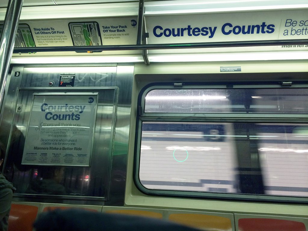
My destination was the New York Transit Museum in downtown Brooklyn, housed in an old subway station on the corner of Boerum and Schermerhorn. Thanks to the skint, I signed up last minute for an after-hours presentation on Subway Etiquette: Then and Now. The MTA’s latest ad campaign, Courtesy Counts, has been a huge success for taking on some of the most irksome pet peeves for public transportation.

IMG_4421

The behaviors in question came almost exclusively from customer feedback letters and emails, according to MTA Corporate Comm Chief Connie Depalma. My primary peeve -not letting people out before trying to get in- was there, followed by my close second hated, the manspreading. Her own personal peeve was nail clipping and nail polish on the LIRR. I’ve experienced both of those as well, but they are a rarer annoyance.

Unfortunately, I missed the first half of the panel discussion because of the situation at Borough Hall. What I did hear was the Director of Graphics, Rick Stewart, discuss his approach to drawing the characters, his method of demonstrating desired versus disruptive behavior on public transportation. You see a couple of them in the upper left corner below:

IMG_4422

One woman had a great follow-up question that I felt he glossed over too quickly, missing some intrinsic social-cultural-racial issues wrapped within the question: why were positive behaviors more frequently depicted by green figures in ties and professional dress as compared to the negative behaviors (as red characters) who were unadorned? I was looking at this more closely when I was in the subway last night and took the photos above. While there is some mix of minor style implications on the figures, it would have been interesting to offer several variations within the same compositions to show that everyone is guilty when it comes to breaches of transportation etiquette.

For me, her question pushed to mind some of the most crowded and tense subway rides that I’ve experienced (on the 4,5,6 especially) during rush hour, populated with the more formally dressed business folks. I have witnessed significant social faux pas amongst that population, even more frustrating because their attitude is that they are above the common social expectation of situational awareness.

In the wake of the shooting at Borough Hall, I also wonder how the courtesy lapses between passengers (both the 3 men in questions and other bystanders) contributed to the escalation between the shooter and the two other men…

Just wish we had explored that question a bit deeper, exposing some of the assumptions made by the graphics department on who exhibits what behaviors.

Back to type-related things!

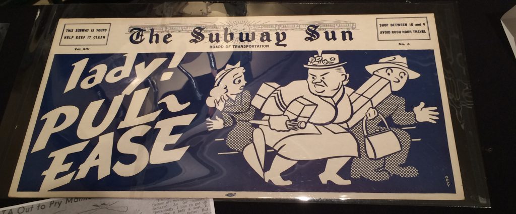
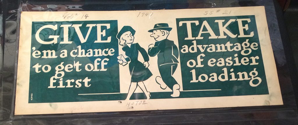
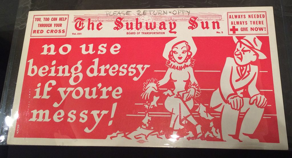
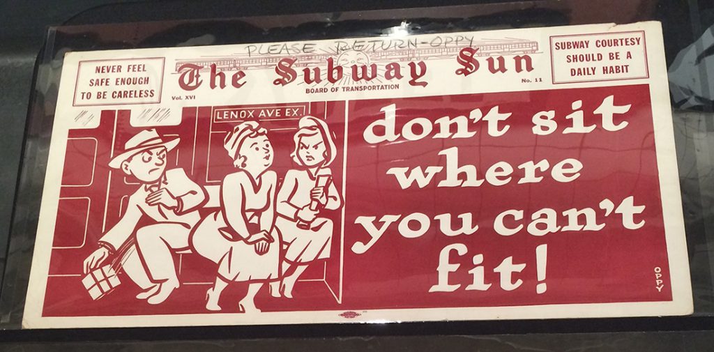
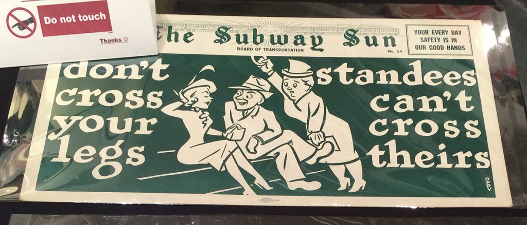
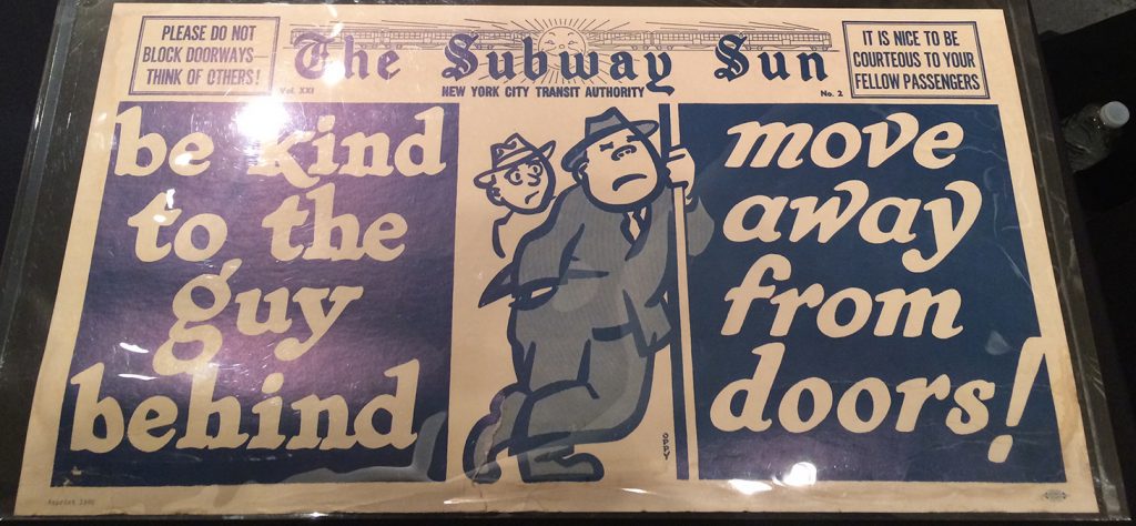
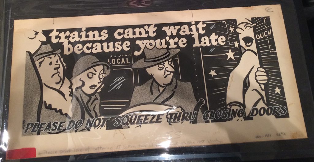
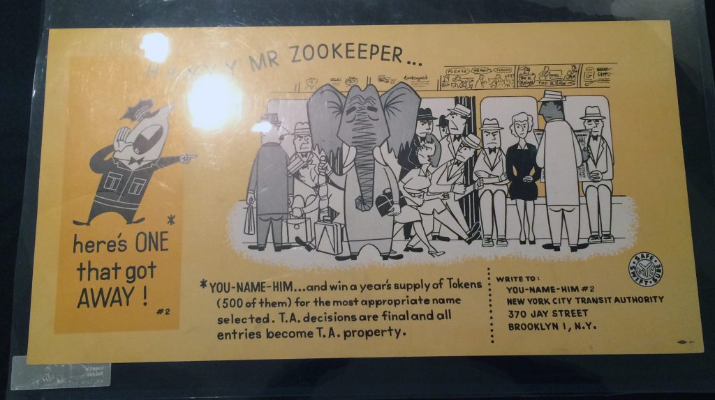
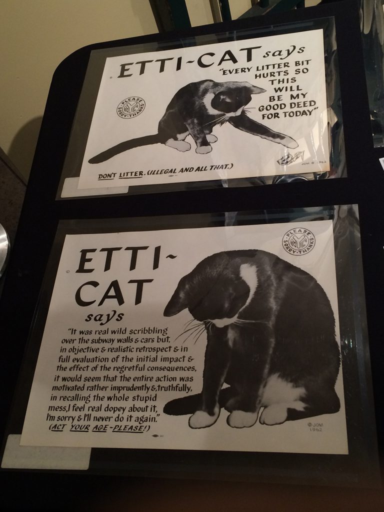
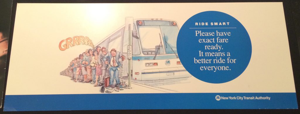
My main interest in attended was viewing some of the subways ads pulled from the archives that covered many of the same issues that the current courtesy campaign was tackling. The humor was unique to each time period, except for a stale period in the late 80’s and 90’s where the ads were bland and sanitary. I remembered that era from trips to the city as a kid for motorcycle shows at the Javitz center.

Below are some mediocre iPhone photos of the collection on display.

IMG_4407

IMG_4403 1

IMG_4404 2

As a fatty, this one made me chuckle. If I’m dying, I will squeeze between but most often I’m too self conscious about fitting and touching other people to do it.

IMG_4404 1

IMG_4405 1

Note the transition from Board of Transportation to New York City Transit Authority, which took place in 1953:

IMG_4405 2

This print in particular stood out, it wasn’t a finished product. The bottom line was added on by hand:

IMG_4403 2

A naming contest for the ‘animals’ of transit:IMG_4401 copy

1962’s Etticat should really make a comeback. The internet awaits! IMG_4408

If you look closely, you’ll see a small logo on the previous ads. That’s the Amalgamated Lithographers of America, started from a secret fishing club.

The drab:IMG_4402

IMG_4400

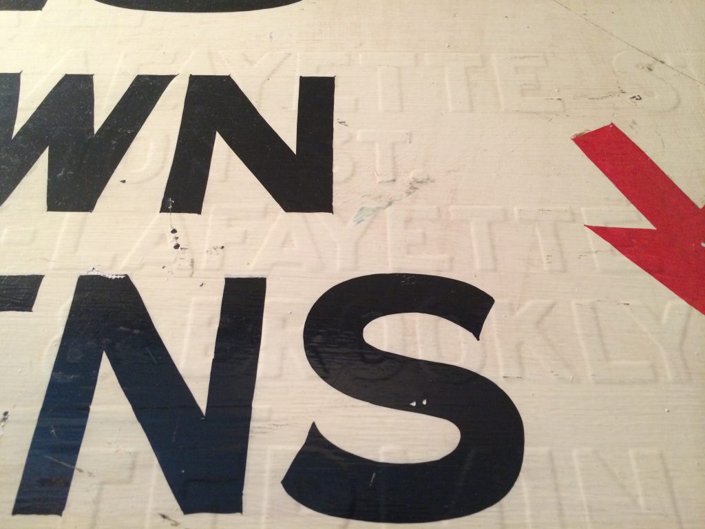
Attendees were allowed to putter around the museum afterwards. This wasn’t my first visit, I had taken my best friend Sarita as a Christmas present a few years ago. Since then, my interests have changed significantly and I was looking carefully at the signage, the markings of who made them, manner of production, etc. I noticed that some were even painted over and over again.

IMG_4412

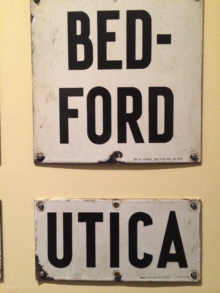
These two signs below were enamel/porcelain on metal, a method of production that only lasted for a short time in the US (1890s-1940s). It was an easy way to reproduce signage (with stencils at first but later on, by silkscreen) but it wasn’t necessarily cheap. When WWII kicked in, the metal needed for the base of these signs was diverted to war-related manufacturing. That was the end of the enamel sign in America.

IMG_4409

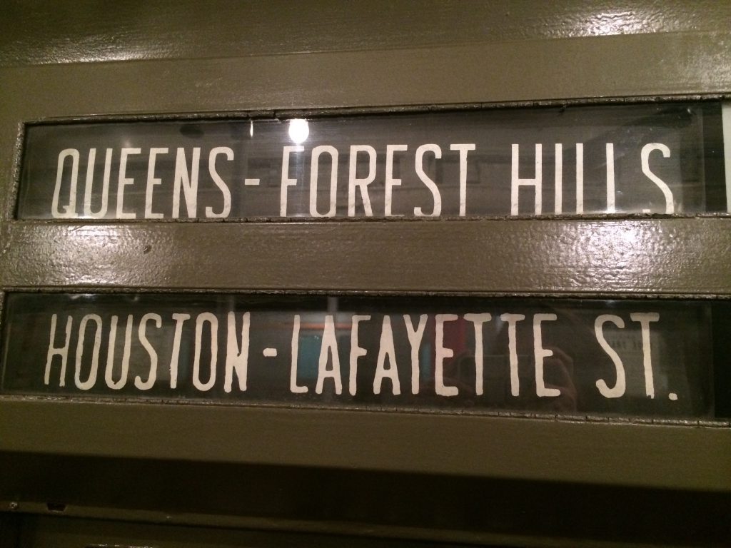
One of the highlights of the museum is the collection of subway cars spanning the last 80 years. In the older train cars from the 1930s, you can see that the destination signs were a bit shaky and irregular.

IMG_4419

The older cars are olive green, riveted, perfunctory, the whole car felt almost militant aside from the woven seat covers. The hand-written signs soften it up quite a bit. Maybe it was a temporary solution or a late add-on? Maybe the museum added it?

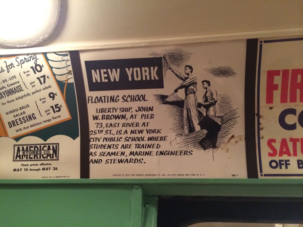
The ads in the cars were also fun. I didn’t get to ask if they were originally in the car or just there to give a flavor of what the ride would be like. This one in particular was my favorite:

IMG_4420

If you haven’t visited yet, definitely check out the NY Transit Museum. I am adding it to my short list of suggestions for people who visit NYC and don’t want to do the ‘touristy’ stuff. Public transportation is such an important part of living here that learning about its history can only give you that much more insight to the city itself.


Creating a Type: Mickel’s Creation of Router

In November, I went on a shopping spree on Amazon and bought a bunch of graphic design and typography books that were highly recommended on pertinent subreddits. The thought process was, “I’ve essentially dicked around with design and type as a hobby for much of my life, it is time to sink into the wealth of knowledge and theory that underlies practice.”

My first round of purchases included Making and Breaking the Grid (Timothy Samara), Meggs’ History of Graphic Design, and Thinking with Type (Ellen Lupton). I’ll obviously be plugging through Meggs for the next 10 years, but the other two books went quick. I hungrily read them up on my train rides to work, pieces of advice I’d heard in passing before and all sorts of functionalities in ACS finally made sense (example: ALIGN TO GRID! Now I get it. I feel like an idiot.)

Lupton’s book really blew open my brain and is what inspired me to start this blog. As I started to pay more attention to the typefaces and fonts I used for my own work, and to what was presented to me from the world at large, I decided, “Well, I want to make a font!”

Having little to no comprehension of just how –hard-timeconsuming-intense-precise-detailorientied- it would be to make a typeface from scratch, I started googling with the idea that I would make one of my own. (ha.)

And so, I came across this piece from Jeremy Mickel on I Love Typography, about his experience designing Router based on a handmade MTA sign. This post is the reason I abandoned (for the immediate future) any ideas of making my own font. Mickel was already an established graphic designer with much more expertise and skill, and it took him a year and a half.

“This moment of inspiration in a subway station was the beginning of the year-and-a-half process of designing my first typeface, and the start of an obsession that would permanently change the way I experienced the world. I thought I knew a lot about type as a graphic designer, but I soon realized that the art of typography went much further and deeper than I could have imagined.”

While his process was daunting, it did inspire me to push harder into learning about what has already happened in the world of typography. To learn the fundamentals and what came before, how written word has evolved through time, how technologies shaped that evolution, how that evolution plays out today with much lower obstacles to participation in this process. With that in mind, to pay more attention to the artistry and craftsmanship behind typefaces, and know what to look for in a good design.

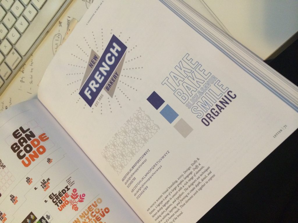
What also caught my eye, was that the font Mickel created, Router, was used in a type example in Lupton’s book but wasn’t explicitly mentioned:

IMG_4373

See the swelling that Mickel talks about? This is the distinctive feature of the font that made it possible to identify. I remember when I was reading, really liking the logo and how the font was incorporated. Then maybe 2-3 weeks later, I happen to stumble upon the story of its genesis? It was one of those moments where you start thinking that there may be some order to existence after all. (Momentary thought, jury is still out for me.)

And as my last takeaway, I learned to be on the lookout for more of these legacy treasures, peppered throughout New York City. I watch for indicators that a sign was handmade, tiled on site, handpainted, etc. The city expanded in an era where aesthetics and grandeur were important, there are gorgeous views all around. At the very least, it makes waiting for the subway late at night hat much more bearable and beautiful.

Close Bitnami banner
Bitnami